(follow up…)
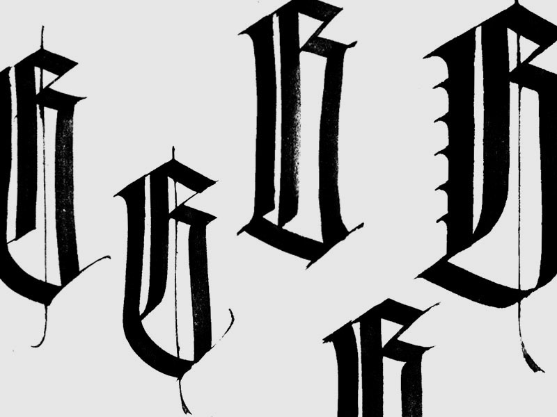
«Ivan, I need a cool gothic “G” of Gutenberg for next Saturday’s workshop». That was -in brief- the request what I e-mailed Ivan Castro a couple of weeks before the workshop on the occasion of the Gutenberg Year.

Although the initial idea was to integrate the two workshops (which took place simultaneously and in adjacent spaces of the BAU school), it was not easy to do so for logistical and time purposes, so this seemed to me to be a halfway but acceptable solution.
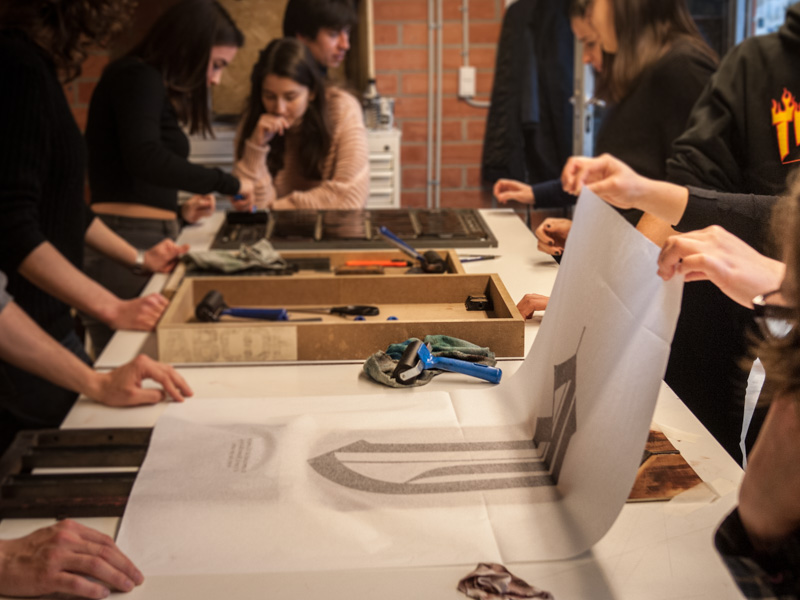
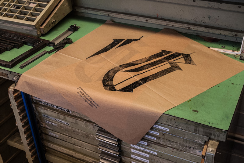
 If the previous work (the set of coasters) required a careful impression due to the small size and the pieces it contained, in this case – with the exception of the closing text – it was the opposite. The generous dimensions of the final format made it impossible to use any type of press we had at our disposition, so we used very thin paper on which we applied manual pressure with dry roller.
 The letter dimensions made it ideal for testing a double inking system to look for different textures, so we prepared inks with slight variations of brightness in brown and black tones respectively. In these images we see several samples on manila paper, although taking into account the commemorated character and the type of printing, it seemed especially relevant to me to try also with “bible paper”.
(Concluye en la próxima entrada)
– – – – – – – – – – – – – – – – – – – –


