The New
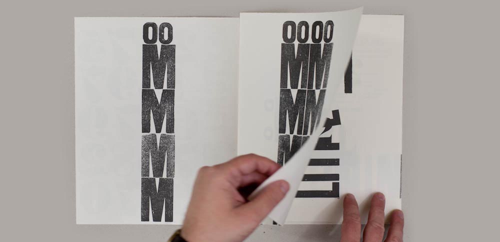
Free adaptation of The Next Call #05 magazine by H. N. Werkman published in June 1924. Printed in two colors, 8 pages and 40 copies. 10¾ x 8½ in. (27,4 x 21,5 cm.)
On page 2 of the original magazine an ampersand sign appears as a “typographical bird” perched on a vertical block in which 2 letters “j” help to give a monumental character to the whole thing. The same sculptural treatment of typography is repeated on pages 5 and 7. Another of the unique elements of the publication is a Dadaist text on the third page that ends being the fundamental element of the interpretation.
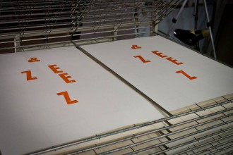
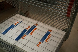
In this case a summary of the main elements is proposed in which the printing density of the text mentioned- is reproduce as the central element kipping the hierarchical criteria of the original- found its counterpoint in chromatic touches of the background structure, which plays back again the idea of “typographic sculpture” using blocks and some letters such as E and Z, the same main elements that appear in the original.
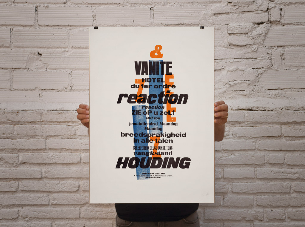
Limited edition of 40 sealed, signed and numbered prints.
–
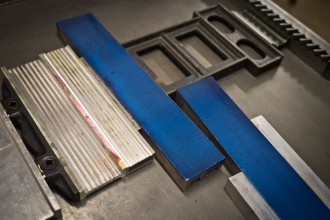
Letterpress printed in four runs in a Korrex Hannover 1964
with three colors on Colorplan Smooth Natural 175 gr. G. F. Smith’s paper
–
Size: 19 ¾ x 27 ½” (50x70cm.)
–
€ 45
The Next Call #05
H. N. Werkman
–
Facsimile of the original journal, published in June 1924
–
8 pages
40 copies
–
27.2 x 21.5 cm.
10¾ x 8½ in.

